
Working With IKEA’s PAX Wardrobe Units
July 5, 2014 § Leave a comment
Earlier this year, we were hired to design and build some wardrobe units for a client in Snoqualmie, WA, using IKEA’s PAX system. The house already had a sort of craftsman-like feel with lots of crown molding, and wainscoting throughout, and the customer was really attracted to that style. So the challenge was to make the somewhat plain looking PAX units feel more custom-built and integrated.
We achieved this by building up the top and base, so we could incorporate the existing base and crown moldings. Then it was just a matter of getting the painter to match his paint to the cabinets to tie it all together.


That TV looks so small!
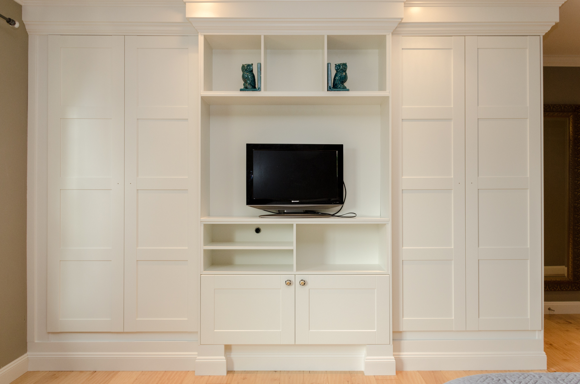
Here we used a combination of IKEA’s PAX and kitchen cabinets (ADEL off-white) to create a wardrobe/media-center. Using matching panels from the kitchen department allowed us to create the partitions and shelves.

Pulling out the middle section and adding feet was a nice touch. Elements like these add dimension, and emphasize that custom look
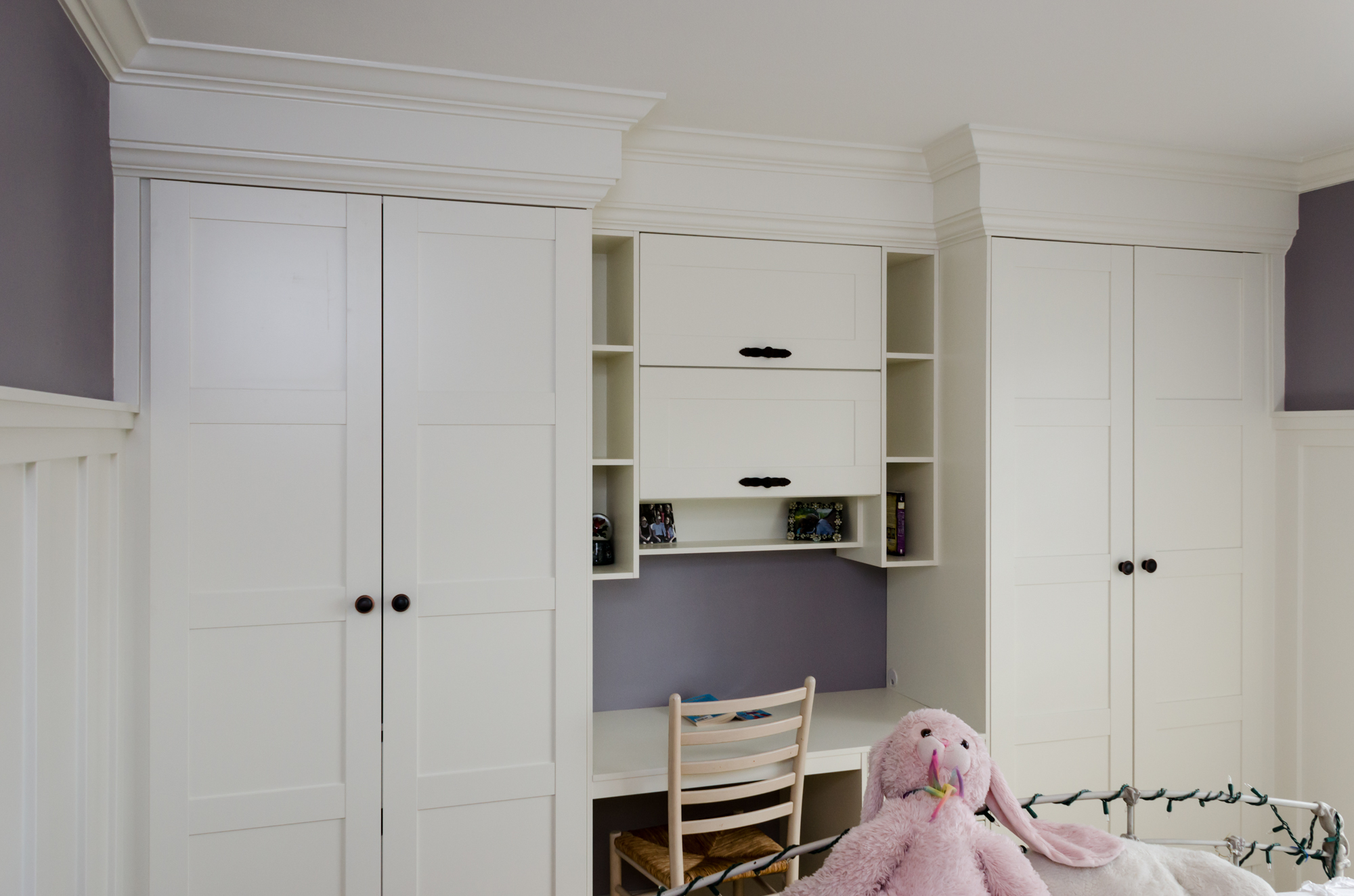 For the girls bedroom we created a combination wardrobe/study area using cabinets from IKEA’s kitchen series for extra storage, and some extra panels to create the open shelves.
 To create the drawer unit for the desk area, we cut down the height of a kitchen base cabinet so the desk top would sit at a comfortable 30″ this still allowed for 3 small drawers and the extra tall base.

Someday, I’ll get a wide angle lens so I can better show off these small rooms!
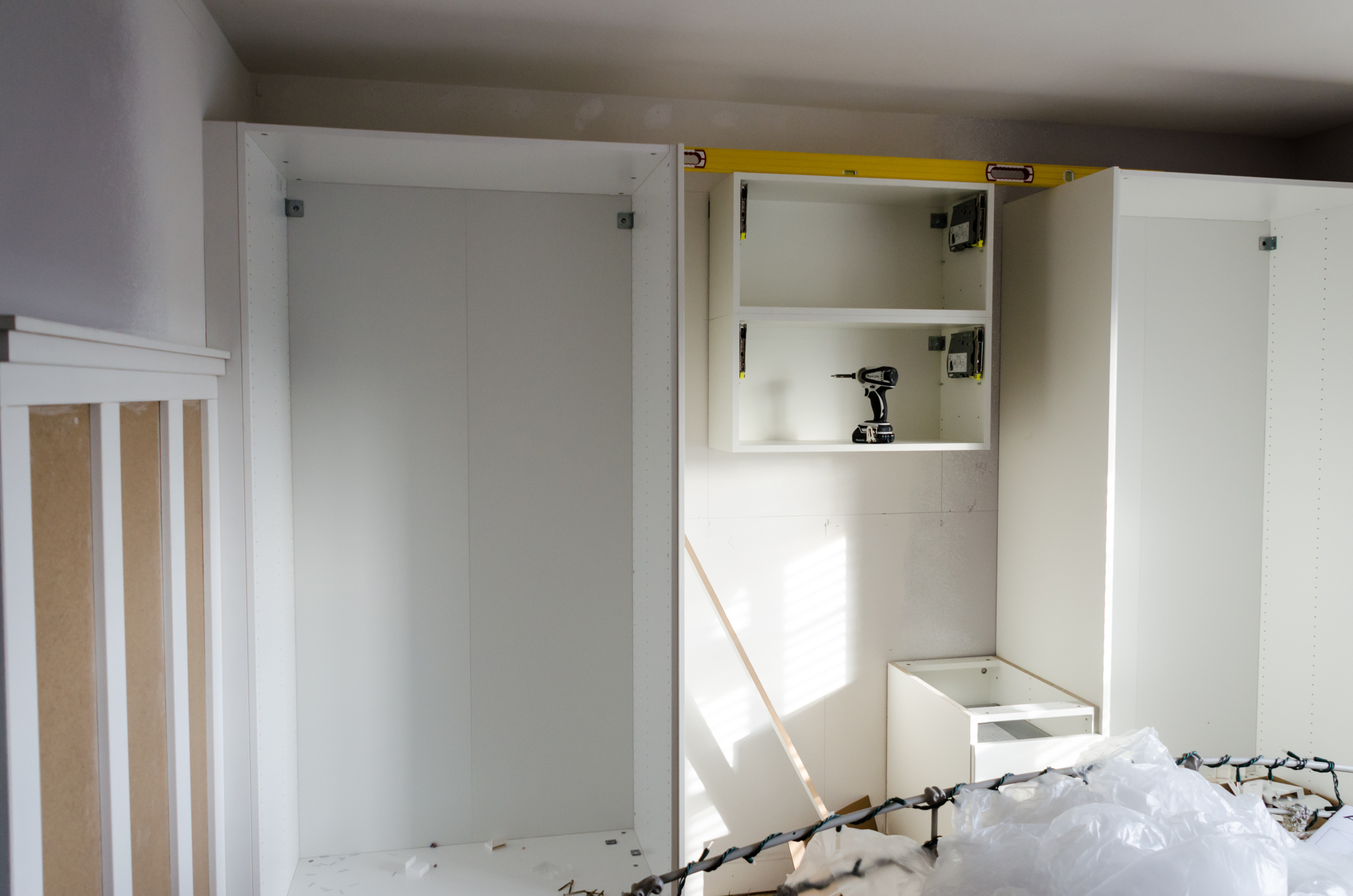
Remodeling the walk-in closet for the master bedroom was a simpler affair. Here we used the PAX units in a more standard fashion, just adding in the crown molding to tie it in with the rest of the house.
Craftsman Style Kitchen
March 9, 2014 § Leave a comment

Last month we finished work on this beautiful Craftsman style kitchen in Tacoma, WA for homeowners, Robert and Timothy who happen to be tile makers, and owners of Grid Architectural Surfaces + Tile. As you can see their handmade tile features prominently here on the floor and the backsplash.

I really think Robert and Timothy did a fantastic job of opening up and updating the kitchen while still preserving the incredible character of their home.

It seems like wet bars went out of style for a while there, but they are definitely making a comeback and we find ourselves installing more and more of them in the kitchens we remodel. For the backsplash Robert and Timothy were able to re-purpose the glass panels from the dining room wainscoting which were removed when they opened up the entryway to the kitchen. The glass was cut into hexagonal tiles at their studio using a water jet, then carefully arranged into sheets for installation.

No matter how much we tweaked the cabinet design, we kept ending up with a bunch of extra space next to the fridge. Not wanting that space to go to waste, I suggested we build some open shelves using matching panels from IKEA. In the end it looks great, and works perfectly for storing bottles of wine, glasses, and decorative pieces.

I really love the handmade hexagonal tile here. The variation in color and slight imperfections and differences in each tile combine to create a richness and depth of character that you just can’t get with factory made commercial tile.

To finish off the end of the island, and to add support for the granite, we decided to make a custom open shelf cabinet using matching panels from IKEA.

IKEA’s LIDINGO cabinets were a perfect choice for this kitchen. The cabinets look perfectly at home amongst the traditional moldings and the original coffered ceiling in this 1905 house.

Finishing touch: The tile ended up a little higher than the hardwoods in the dining room, and while most people would have just settled for a wood or metal transition strip, these guys are perfectionists, so they decided to make these custom bullnose tiles by hand. It was tricky business because, being an older house, the room wasn’t perfectly square so each tile had to be individually shaped to the room to get a nice straight line.
All in all it was a fun project for us, and another project we are proud to have been a part of!
All I Want for Christmas is a New Kitchen
January 1, 2014 § 2 Comments
 Last Month we finished remodeling this beautiful kitchen in Issaquah, WA. just in time for Christmas. In fact we cut it pretty close, and ended up working on Christmas Eve, connecting the gas and hooking up the cooktop!

Before
Humble beginnings: These guys have been waiting a long time to update this tired old kitchen!

They really wanted a big open space, so the plan from the beginning was to take out this wall between the family room and the kitchen

Before
The ceilings throughout the house were kind of low to begin with at only 93″, so the dropped ceiling in the kitchen just didn’t make any sense. So it definitely had to go, and that gave us a good excuse to scrape the popcorn texture off the surrounding ceilings while we were at it.
When you’re planning to make major changes to a kitchen, it’s a really good idea to draw it up first with scale drawings and a 3D model. So that’s exactly what we did, and after a few revisions we had a design to work from and it was time to get to work!

The glass mosaic backsplash that the customers picked out looks great. I really like that they decided to go all the way to the ceiling instead of just stopping at the cabinets.

For the microwave, we created a built-in look, by cutting out the center of a 24×15″ door. To get the microwave to sit back far enough, we actually had to cut out the back of the cabinet, and create a recessed frame in the wall! Hey, whatever it takes, right!

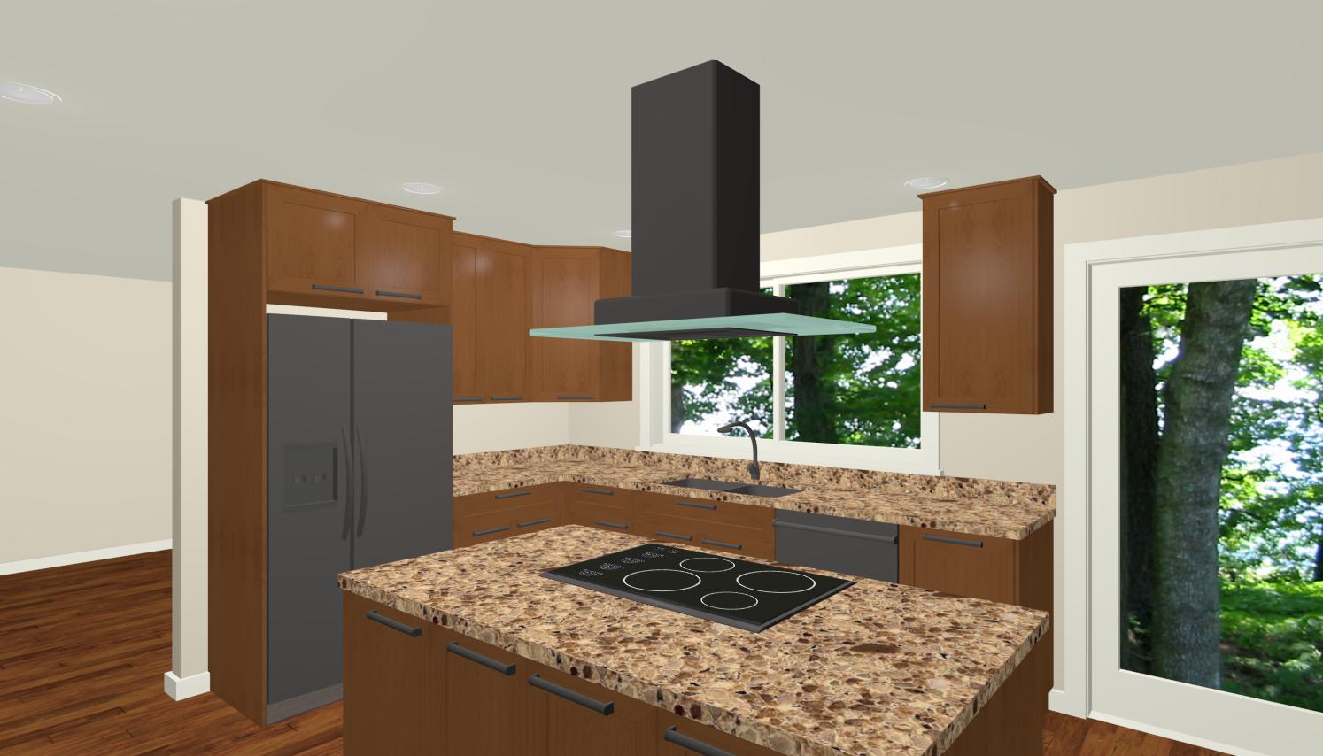
It seems like whenever I design a kitchen with the cooktop in the island or peninsula we always get hung up on the subject of ventilation. No matter how well these hoods are designed, no one really likes having them hanging in their face and blocking their view while they’re cooking. The alternative of course is to have a downdraft, but the problem with those is that they’re really not as effective as a regular hood, and in the case of this kitchen, they have a built-in oven under the cooktop, so there’s no room for a downdraft. The solution here was to get a really good strong fan, and mount it above eye level.
Everything came out just as we all had hoped, and I have a feeling there will be a lot more holiday memories made in this kitchen!
Vashon Island Kitchen Part 2
December 3, 2013 § Leave a comment
Earlier this year, we started on this kitchen renovation over on beautiful Vashon Island, and even though there are still a few touch ups to do yet, we are all very proud of the way it came out, and I just couldn’t wait to share some pictures. If you missed the first part of this post, go check out Vashon Island Kitchen Part 1.
It’s hard to believe that this is what the kitchen used to look like!!

Cabinets go in…

Floor goes in…

Countertops go in…

Really awesome lighting fixtures and appliances go in…

And we’re done!!
Well, almost. There are still a few touch-ups to do yet, but you get the idea. 😉
What do you think? Leave a comment!
IKEA Hacks and Other Fun Stuff
December 1, 2013 § 2 Comments

Stacking the cabinets takes advantage of this home’s 9′ ceiling height. Please ignore the blue protective film!
A couple of months ago, we finished this exciting kitchen in Renton, WA. I say exciting, because it’s packed full of fun little customizations that you don’t see every day in your typical IKEA kitchen. Unfortunately, I haven’t had a chance yet to go back and get the final pictures, but I decided to post the pictures I have now so you can see some of the cool details.
In the picture above, you can see that we took advantage of the home’s 9′ ceilings by stacking an extra row of 15″ tall cabinets on top. In previous decades, the common school of thought was to keep all the cabinets low and within reach, so they would either drop the ceiling, build a soffit, or just leave an empty space above the cabinets, as was the case in the original kitchen.

This is what the kitchen used to look like. Hard to believe, right!
One of the more popular features of IKEA cabinets is the pull-out shelves. Unfortunately, they don’t make the pull-out shelves for their 30″ wide cabinets. However, since all the hardware for IKEA cabinets is made by Blum, we decided to look to them for a solution, and we were in luck. Blum makes a line called Tandembox and with the right combination of pieces, it worked out perfectly in our 30 and even 36″ cabinets!

IKEA’s 30″ pantry cabinet with Blum Tandembox pull-out shelves.
One of the challenges with this design was how to deal with the blind corner we had next to the microwave:

Appliance garage (closed)
We didn’t want to just leave an open space there for clutter to gather, but if we had used a standard hinged door, any items on the counter would have to be cleared away whenever you opened the door. Here again, Blum came to our rescue with their Parallel lift system from their Aventos line:

The parallel lift door system worked perfectly for this appliance garage.
The homeowner came up with this cool idea for utensil storage based on something similar she saw on the internet:

This custom utensil drawer is a neat idea.
The pull out trash drawer isn’t really anything special, but I wanted to feature it here because I have found that a lot of people who try to design their own kitchens using the online IKEA planner don’t realize that you can make these in any size (the planner only shows them in 12″). This one is 18″ wide, which is just right for two trash cans to sit back to back. We put a pull out shelf on top to store extra trash bags.

The 18″ wide pull-out trash/recycling drawer is just the right size for two trash cans to sit back to back
Finding a convenient location for outlets in the island can be a challenge, so this pop up outlet strip was a great solution. We set it up right next to the cooktop so they could use it to power their stick blender among other things.


This pop-up outlet strip is a clever touch. These are available in all kinds of configurations. Some even come with USB ports for charging your phone.
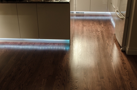
Here are a couple of great uses for LED strip lighting:

LED strip lights under the counter for extra visibility.
Since these lights are so skinny, we were able to install them under the countertop overhang, allowing better visibility for these cabinets.
Setting the toekick lights on a motion detector means the homeowners won’t need to search for the switch or get blinded by the overhead lights when they come down for that midnight snack!
We installed the same lights under all the toekicks for accent lighting. These lights are also set on a motion detector located in the hallway, so they will come on automatically when you walk into the kitchen. Perfect for the middle of the night when you come down for a drink or a snack.
Overall the kitchen came out great, and what a dramatic difference from before:

Before
After the holidays, I’ll go back and take the final pictures without all the blue protective film!
Look for them in a future post!
Small Apartment Kitchen Makeover
October 27, 2013 § 4 Comments
 Early this year, we were asked to renovate this small apartment kitchen in Seattle. Measuring only 6’6″x7′ it’s certainly one of the smallest kitchens I’ve worked on. Heck, most people have closets bigger than that!
So the goal was to open things up, and design the cabinets in a way that would make the most of the small space.

Before
As you can see from the photo above, the original kitchen was really cramped. With just a few cabinets, and very little counter space, this is not a kitchen for someone who really likes to cook and bake like our homeowner. So the first order of business was to open up the wall. With a larger opening into the kitchen, we were able to spill the cabinets out into the dining room, creating more storage and more workspace.

Check out the gas meter above the oven! Never seen that before!
One of the oddest things about the kitchen, is that the gas meter is installed inside! How weird is that?! They tried to get the gas company to move it so they’d have more room for cabinets, but it would have been too costly. Their solution: Hang a pot rack in front of it! Hey, it works.

When dealing with a space this small, you’ve gotta think outside the box. IKEA’s corner wall cabinet here was a smart touch, and the glass fronted wall cabinets can act as a buffet or an extra work space. The shallow depth means they don’t steal too much space from the dining area.

Double stacked wall cabinets
One of the really good things this small space has going for it is it’s tall ceilings. To take advantage of that, we stacked the wall cabinets using IKEA’s 39″ wall cabinets on the bottom, and 15″ high cabinets on top.

under-sized appliances like this 18″ dishwasher help to eke out every inch of space for storage
The owners did a beautiful job designing this kitchen to fit into their 1920’s apartment building. Using IKEA’s “Adel off white” cabinets and “Domsjo” farmhouse sink with brass cup style handles and a gorgeous black marble countertop, it all works so well together.
Do you have a small kitchen? Id love to hear about it. Share your comments below!
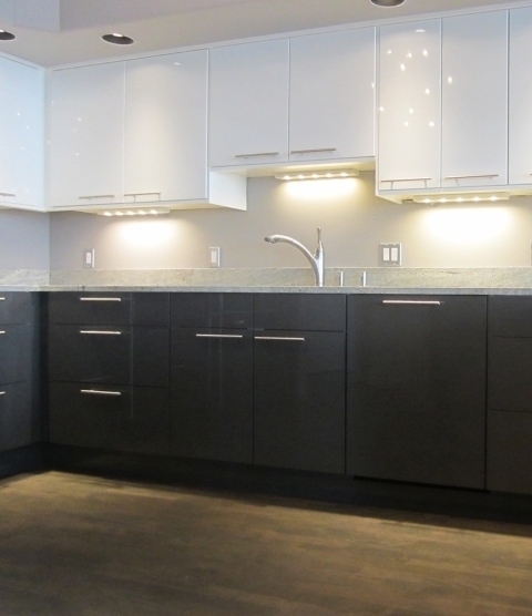
An IKEA kitchen that pops!
September 8, 2013 § 2 Comments
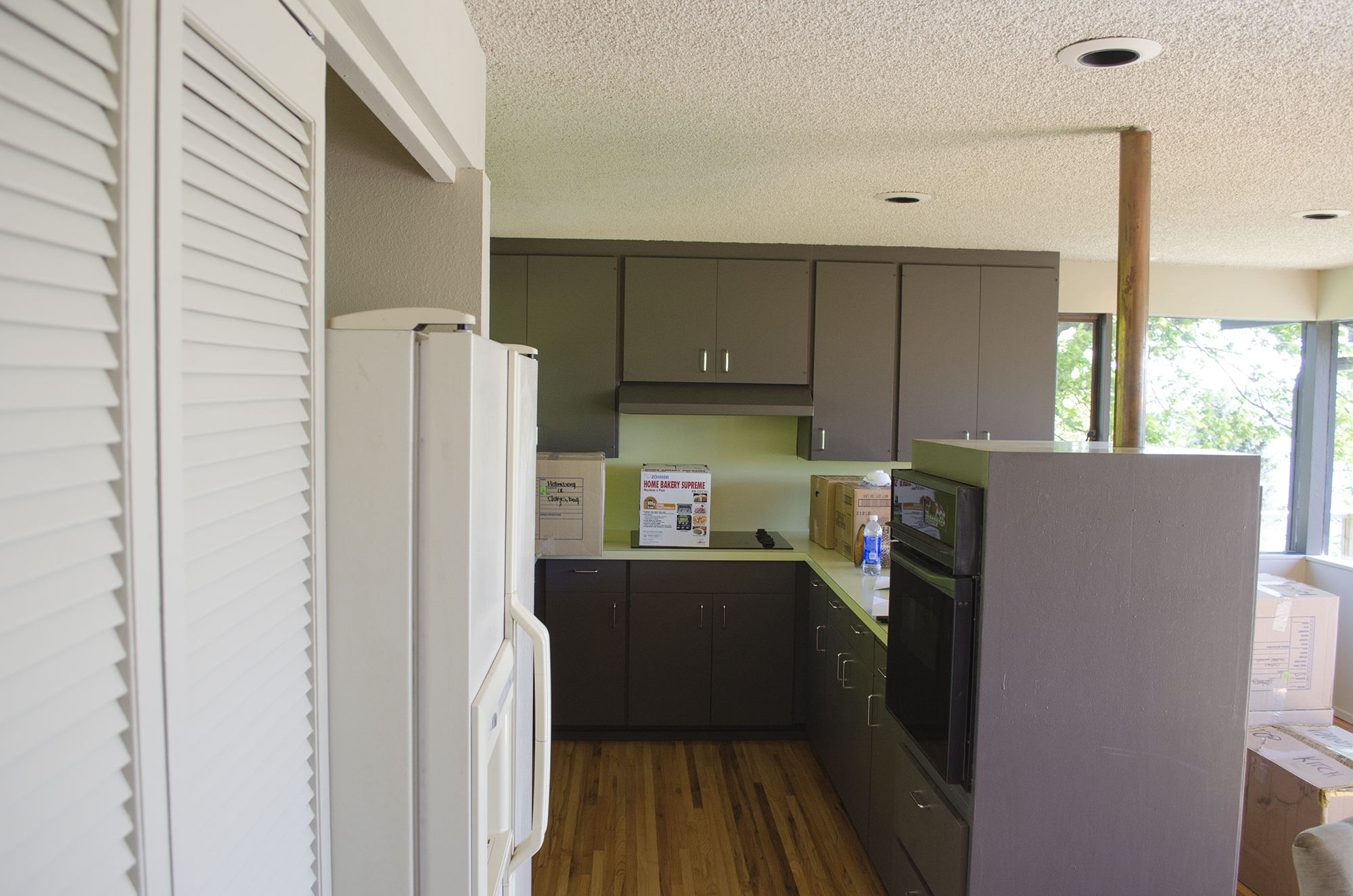
Here are some pictures from our latest kitchen remodel
 These are IKEA’s ABSTRAKT High-Gloss White cabinets.
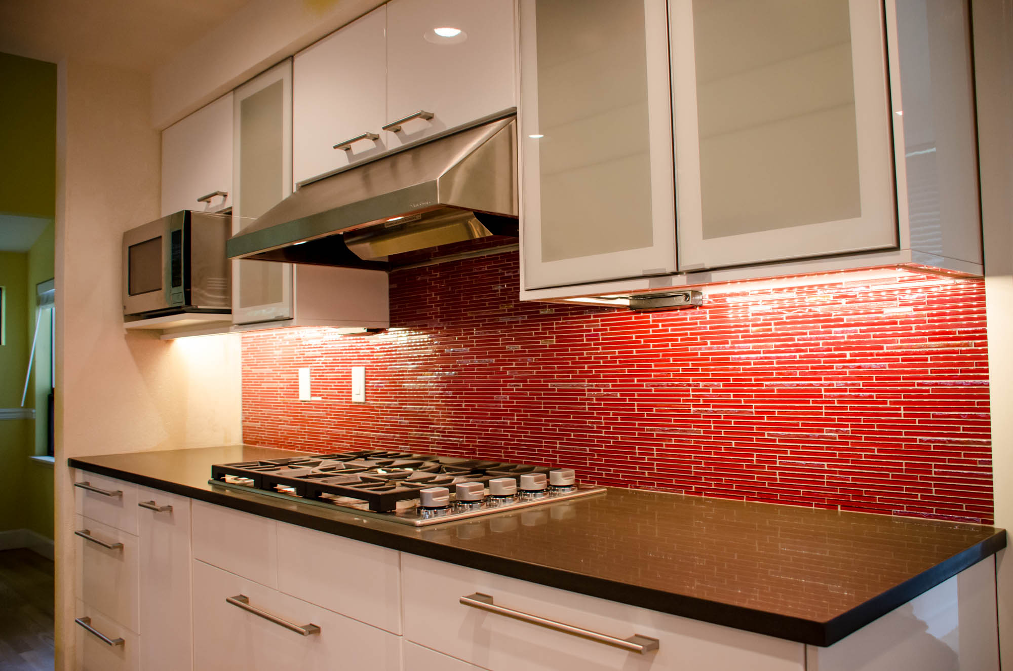 The red glass mosaic backsplash was a bold choice, but it really works here!
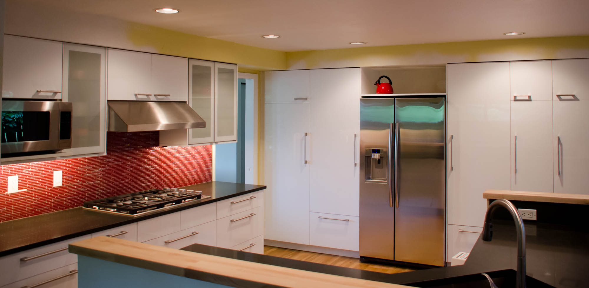 Plenty of storage here, with a whole wall full of full height pantry cabinets!
 IKEA doesn’t make a base corner cabinet with an angled front like this, but we were able to do a simple modification to their lazy-suzan cabinet which allows us to use this corner sink. The 17″ door from IKEA’s wall corner cabinet fits perfectly here.
 This little wet bar area is oh-so-cool. The under cabinet LED lights really make things pop! The wine shelf is custom made using wall cover panels.
Vashon Island Kitchen Part 1: Vaulted Ceiling
August 4, 2013 § 2 Comments

The view from right outside the kitchen. Wow!
Earlier this year I was contacted by some new clients on Vashon Island to remodel their kitchen. Having grown up on Vashon, I jumped at the opportunity. My wife and I have moved away because of our work, but we would both love to move back someday.
One of the big tasks for the kitchen remodel was to remove the ugly, depressing popcorn ceiling, and open the space up with a new vaulted ceiling.
Ugly
I know the 60s and 70s styles are creeping back into modern design, but this is still ugly, and way too small.
 My clients decided to take on the demolition themselves to save a little money, and get rid of any pent-up anger issues. Se we arrived the first day to a relatively clean slate.

Day 1

These trusses have to come out to be replaced by the new posts and beams

Andrey’s sizing things up for the new beams
New plumbing, new wiring, new flooring, new everything!

New Posts and Beams
With the new beams up, and all the electrical and plumbing done, It’s time to put in new insulation, and cover the walls back up. So we called in Ryan our trusty Drywall guy to get it done right!
 With the tongue and groove cedar, the ceiling really starts to take shape.

The finished ceiling came out great. What an improvement from before! We’ve still got lots of work to do though. This week we’ll be painting and installing the cabinets.

What a view! We’re so lucky to be working here none of us will want to leave! Stay tuned for more…
How to Choose Under Cabinet Lighting
July 5, 2013 § Leave a comment
If you’re planning a kitchen remodel, you may be thinking about under cabinet and interior cabinet lighting. Both are great additions to any kitchen, but for the average homeowner, the multitude of choices may be a little confusing. When faced with choices between low voltage and line voltage, or understanding what direct wire means, and then choosing between LED, halogen, fluorescent, and xenon, you might think you need a degree in electrical engineering just to buy some lights. So in this article, I hope to take the mystery out of these terms and provide you with enough information to choose the lighting that will work best for you.
The first thing you need to consider when shopping for your lighting is whether to get hard-wire or plug-in fixtures. This is an easy choice, and it just comes down to budget. Plug in lighting is relatively cheap and easy to install, but you will need a receptacle nearby, and you will have unsightly cords hanging down the wall, and if you have multiple fixtures, they will need to be switched on individually. If this doesn’t sound appealing to you, then you’ll want to look for fixtures labeled: “hard-wire” or “direct-wire”, and unless your kitchen is already set up for these fixtures, you will need an electrician to install new wiring and a switch or dimmer to control the lights. Once that’s sorted out, the next choice you’ll face is bulb type.
The Big Four: Halogen, Fluorescent, Xenon or LED. Each of these has advantages and disadvantages from energy consumption, to quality of light, to cost. Halogen is my least favorite of the four. It’s the least energy efficient, and it gives off a lot of heat. This is a problem in the kitchen because it can cause nearby spices and produce to spoil faster, and all that heat is energy wasted. Furthermore, the bulb life is very short with an average life of about 1,000 hours compared to 50,000 or so with LEDs. The advantages of halogen are the cost of the fixtures (they are one of the cheapest), and the quality of light. Halogen bulbs give off a very warm and inviting glow. They are at the top of the heap for color representation; which is great for setting off your granite countertops, and tile backsplash. Halogen lights are also dimmable, and not all of its competitors have that ability. Still, for me, these advantages aren’t enough to outweigh the disadvantages, so halogens are out of the running for my money.
How about Fluorescent lights? I think these are strong contenders. They are energy efficient, have a long bulb life, with an average of 10,000 hours or so, and are very inexpensive; with fixtures selling for as little as $20 or less. The big problem I have with fluorescent light is that they can be slow to light up – taking a minute sometimes to come to full brightness, and the quality of the light is really poor. It can make your countertop and backsplash seem washed out, and make food look unappetizing. On the other hand, not all fluorescent fixtures are the same. There are better models out there with ballasts which make the lights more stable and faster to light up, and you can get better fluorescent bulbs which give off a more natural light. So if you’re going the fluorescent route, stay away from the cheap $20 and under fixtures. Finally, while there are dimmable fluorescent light bulbs available for some other fixtures, I haven’t yet run across any fluorescent under cabinet lights which are dimmable, so if this is important to you, you should probably consider other options instead.
Next in the line-up: Xenon. Xenon lights are one of my favorites they have the same great quality of light that halogen has, but with a longer bulb life (around 20,000 hours), less energy consumption, and low heat output. They are also dimmable, but the fixtures are more expensive than fluorescent and halogen, and they are not as energy efficient as fluorescent and LED. Be aware that a lot of the xenon fixtures are low-voltage, which may or may not suit your needs. If you’re not sure what this means, I talk about the difference between low and line voltage lighting below.
Finally there is LED. Probably everyone at this point has heard about how energy efficient LEDs are, and how the bulbs last forever. At 100,000 hours of expected life, you’ll probably never have to change the bulbs in your lifetime, which is good, because you can’t really change the bulbs in a lot of these fixtures. Many of these fixtures are also dimmable, but not all, so if you’re shopping for LED and want to use a dimmer, check on this before you buy (you’ll also need to get a special dimmer switch that works with LED lights). The down side: the light can be really cold and uninviting, and they are the most expensive fixtures of the bunch. However, the expense you pay up front may be outweighed in the long run by the money you save on your power bill. If LEDs seem appealing to you, consider shopping for lights which offer a warmer color spectrum.
Another term you may come across when shopping for your fixtures is “low voltage” or “line voltage”. The biggest advantage of low voltage lighting is its size. With this type of lighting, the main guts are separated out into a transformer, which allows the actual lighting fixture to be very low profile. In addition, the wire leading to the fixture is much smaller, can be run through tight spaces, and concealed easier, and is also safer since it only carries 12 volts (as opposed to 120 volts for line voltage wire). The challenge with low voltage lighting is finding a place for the transformer.

An example of a transformer for low voltage under cabinet lighting
The transformer is where the power gets converted from line voltage to low voltage and needs to be installed somewhere nearby. It can’t be concealed behind the wall, and must be accessible, so it usually ends up in the attic or taking up space in the cabinets. Because of this, if you decide to go with low voltage lighting, it’s important to communicate this with your electrician and your cabinet installer. If they are able to plan ahead for the installation, it will save a lot of time and potential headache. Also, be aware that these transformers do put out some heat, and you may notice a humming noise as well. Personally I prefer line voltage fixtures which are wired directly to the house wiring, and are a lot more straight-forward to install.
So that’s it. Hopefully I’ve taken some of the mystery out of all these terms, and now you’re ready to go out and shop for your new lights!
Small Bathroom with Big Style
May 30, 2013 § 5 Comments

Before
Last month we gave this tired old bathroom a much-needed facelift! It was a relatively small job for us, but what made it stand out for me were the finishing touches.

dropped ceiling
I see this all the time in these old houses. They always put in these ridiculous dropped ceilings over the tubs. In this case it’s more of a dropped wall that is so low you actually have to duck to get in. I’ve never understood the purpose behind this, but it’s gotta go!
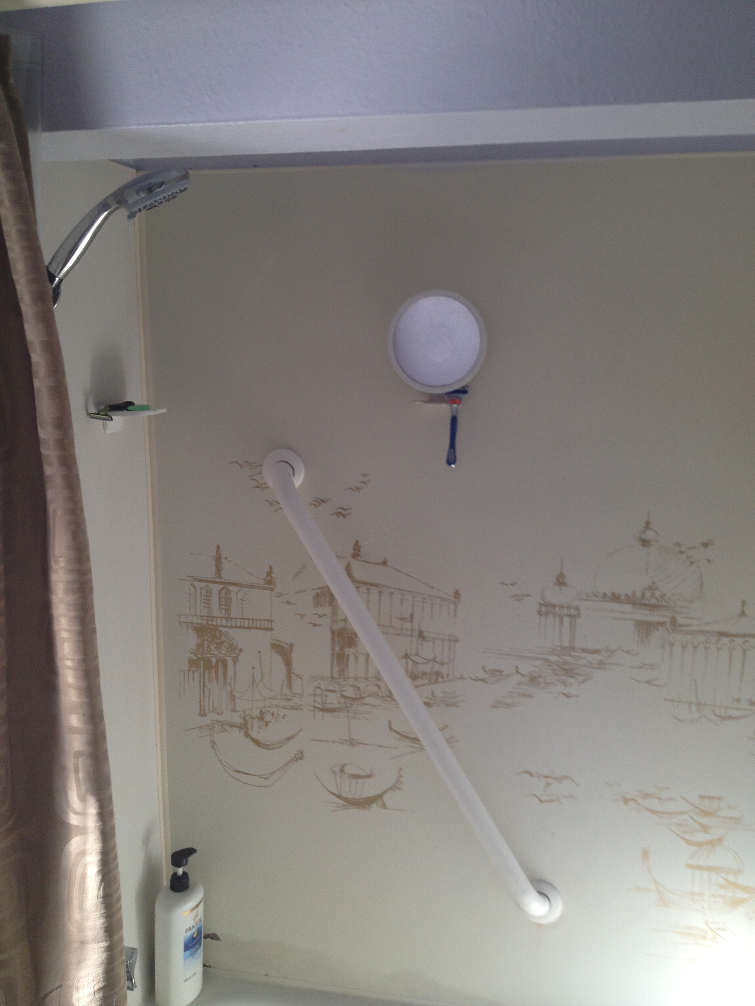
hello 1960?
Gotta love the prints on the old shower surround!

The first thing to go was that silly dropped ceiling. The whole bathroom feels bigger now! We also moved the toilet to a more logical position.
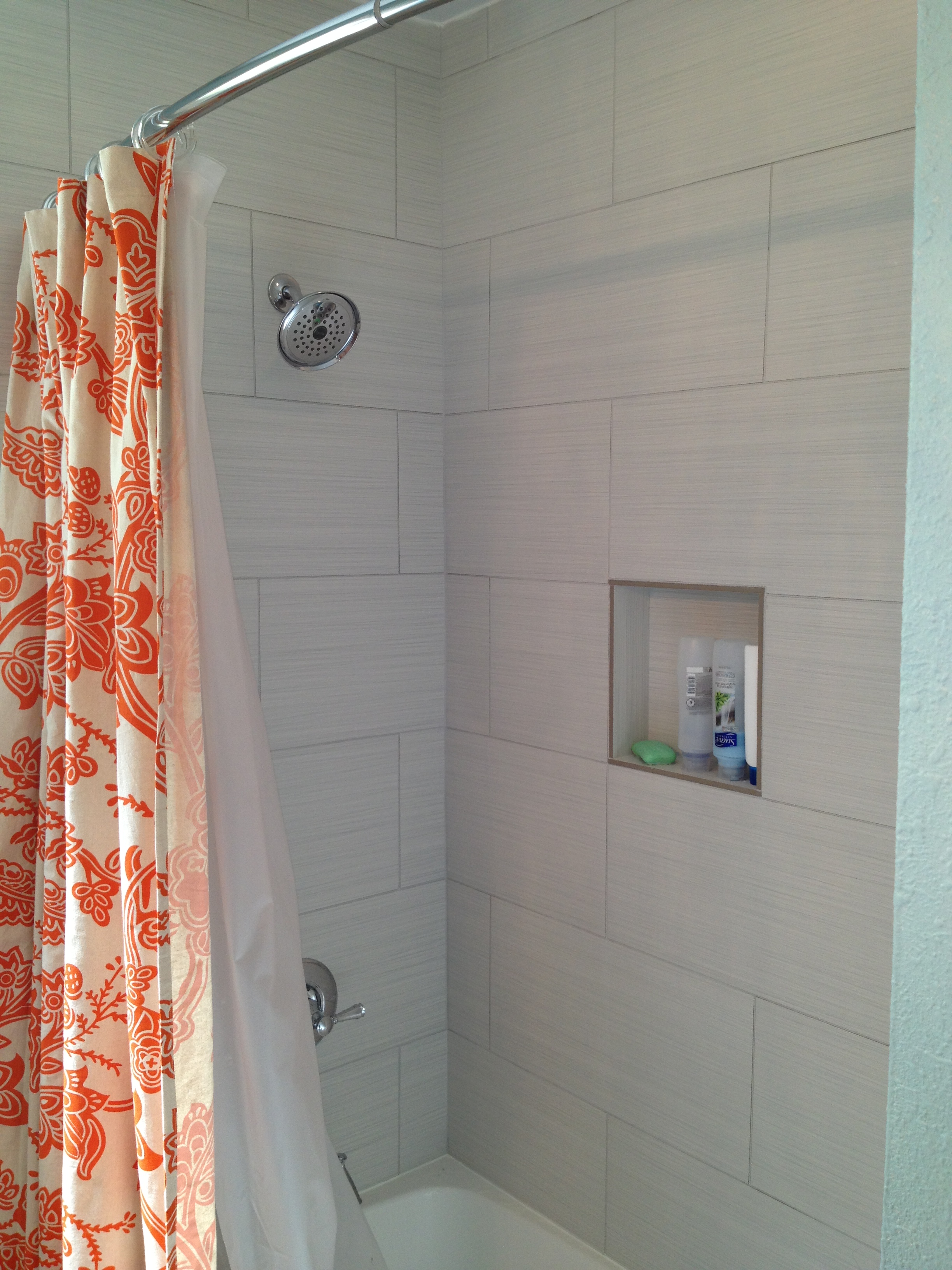
I really like that orange shower curtain
A new tub and tile shower surround were a welcome change. These tiles were a good deal at $3.00/sf from Tile for Less. And I really like that orange shower curtain. A bold choice, but it looks amazing against the Robin’s Egg Blue walls!

beautiful vanity light
This vanity set is fantastic. The customer splurged a bit on the light, paying $300 at Lamps Plus, but it was money well spent imho. You can’t tell so much from the picture, but it casts a beautiful dappled light pattern around the room.
The final touch – which you can’t see – is the heated tile floors. Let me tell you, they will really appreciate the warm tile under their feet when they walk in here in bare feet first thing in the morning.
